Koralle Neue is a digital reimagining of Koralle, an early 20th-century type family from the Schelter und Giesecke type foundry in Leipzig. The guiding design principle was to imagine what the original designers would have done with today’s digital type design workflows.
My classmates and I at the HGB Leipzig attempted a digital revival of Koralle back in 2019/2020 under type designer Stephan Müller, our professor at the time. While most of the original letters have been lost to time, a few fonts and specimens remain. We analysed them extensively and used them as the basis for digital letterforms. While we were able to create digital versions of the individual styles and make them technically compatible, the designs simply did not work as a typeface family. Six whole years later, in 2026, I had an idea for a solution.
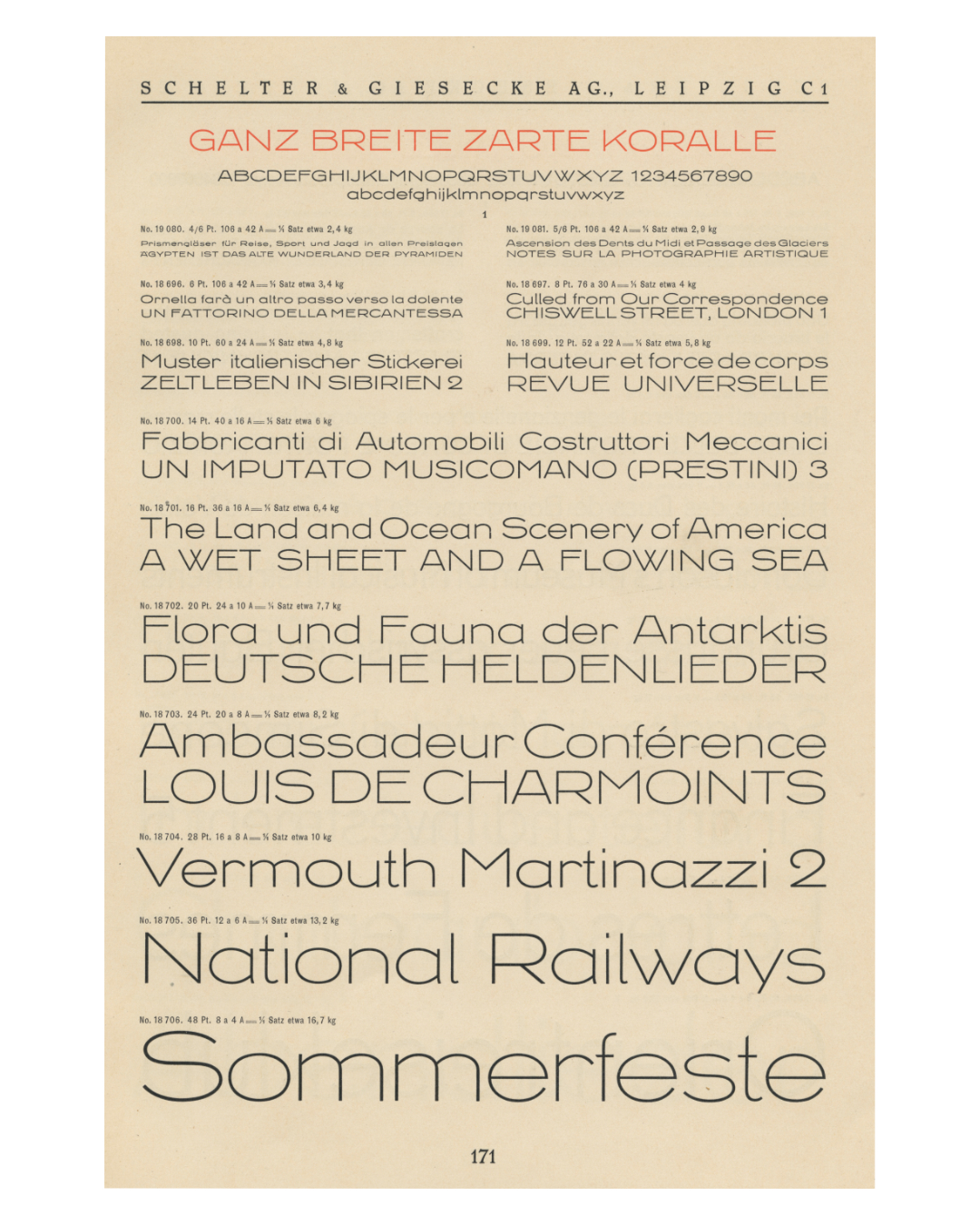
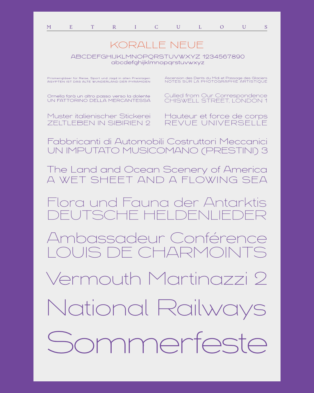
The original design varied even within one style. If you looked at, say, 6 pt and 48 pt versions of the same style side by side, they looked quite different. So even to design one style in a way that was faithful to the original, as we did, we had to extract the essence of the design across different sizes. So why not do that for the whole family as well? Extract the essence of the design and reimagine the styles that deviated from that essence?
To that end, I used “Ganz Breit” and “Ganz Breit Zart” (Extra Wide Regular and Extra Wide Light) as my primary references for the design. While I had drawn precisely those styles in the original project, I drew new masters, guided by the new approach.
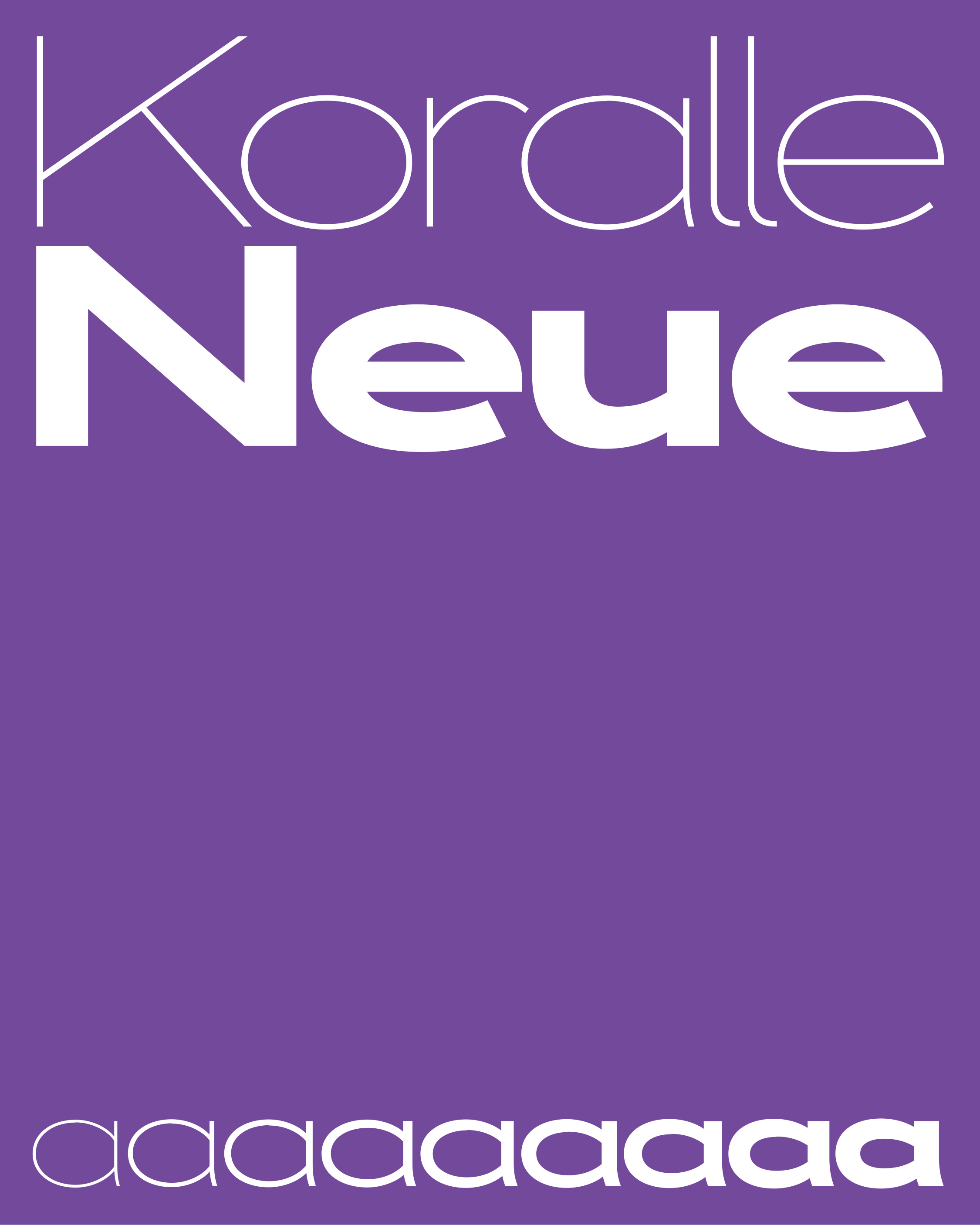
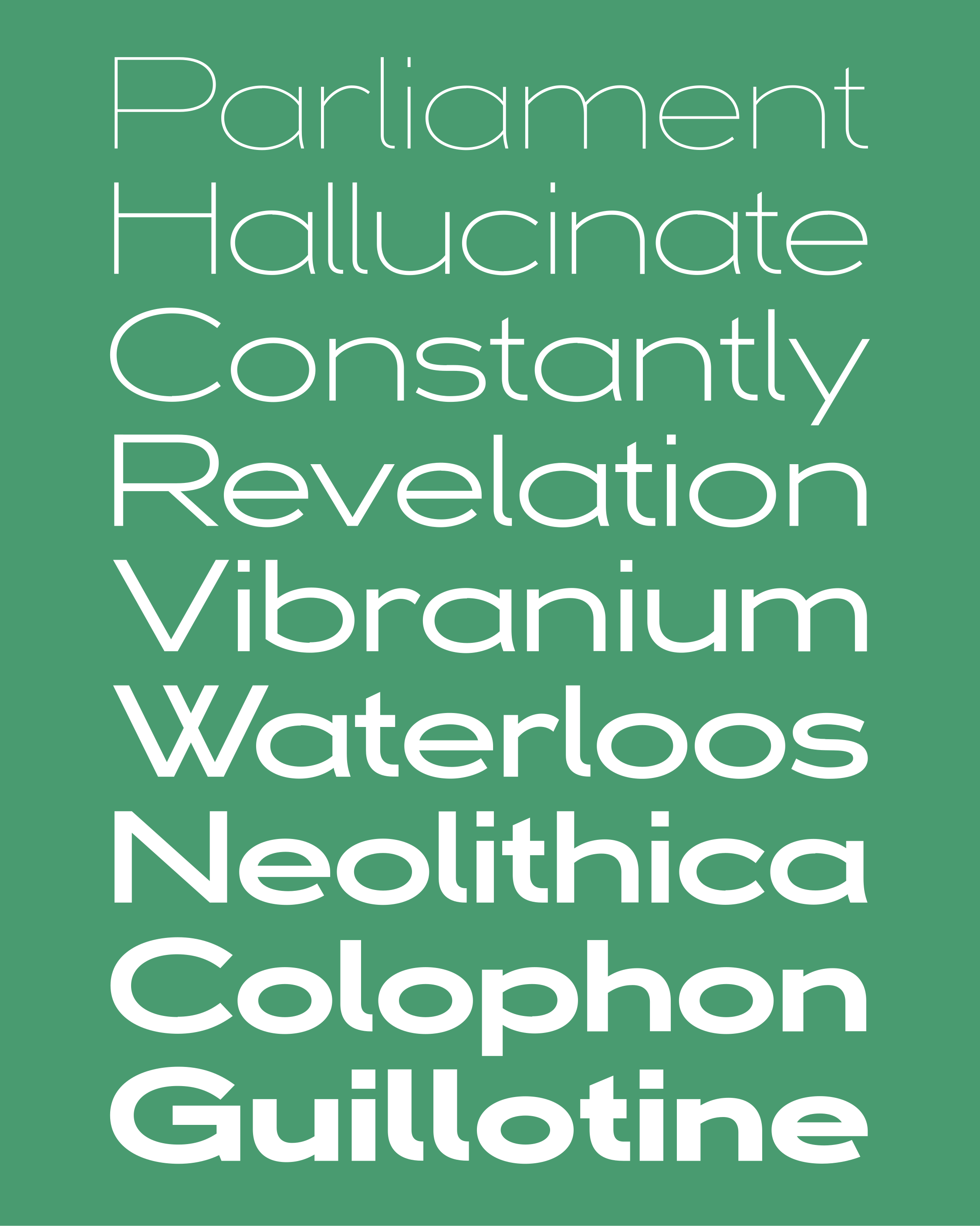
Rather than thinking of the design in one style and adapting it to thicker and thinner styles later, I considered the entire range of styles from the beginning. The resulting heavier weights deviate significantly from the original heavier weights, but are closer to the essence of the original design. Designing the range of weights from the beginning accomplishes this organically. It also prevents big design problems from emerging later.
The individual letterforms are as close to the original as possible without sacrificing consistency across the typeface. The design of a few glyphs has been reimagined, but, again, only in service of retaining the essence of the original.
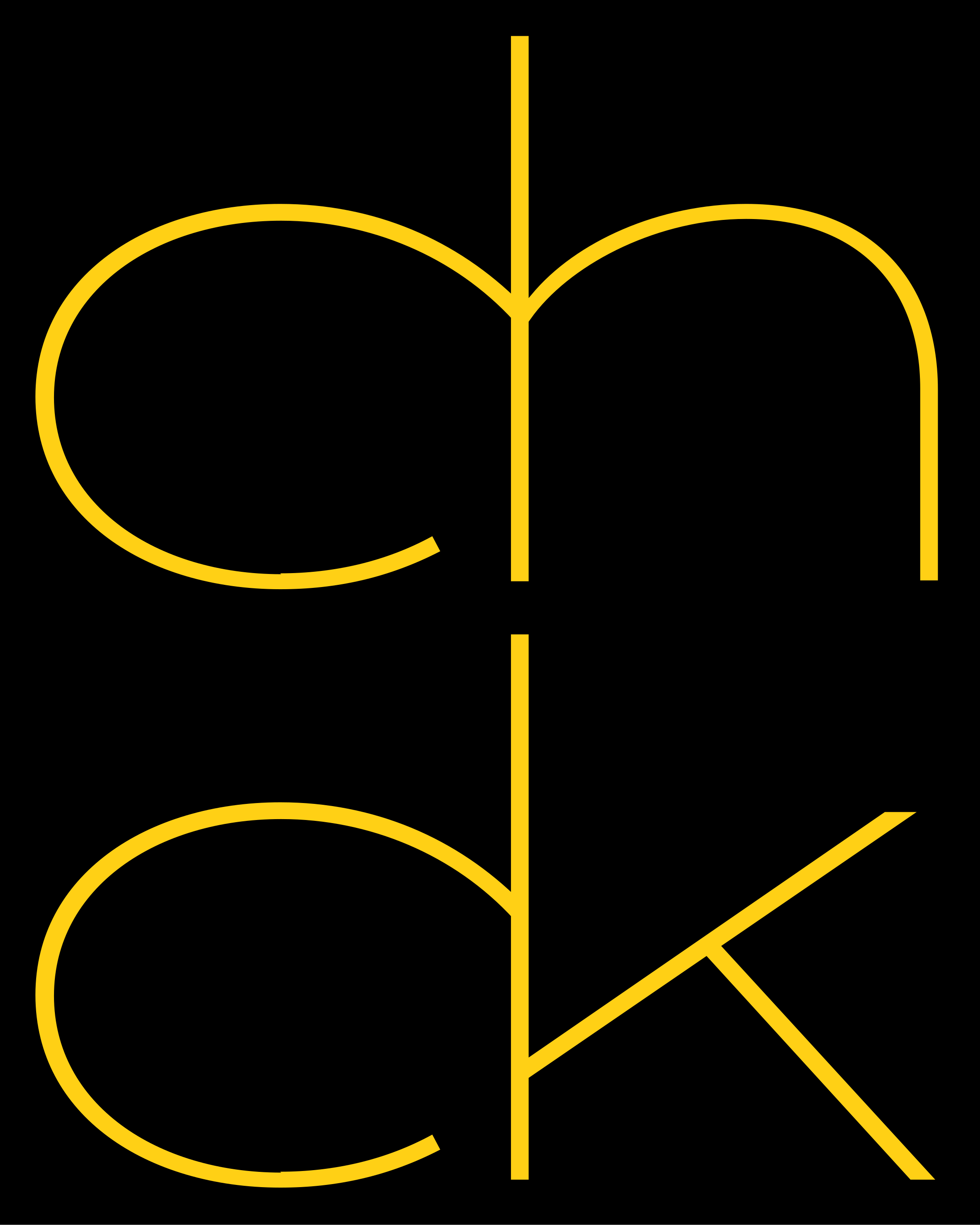

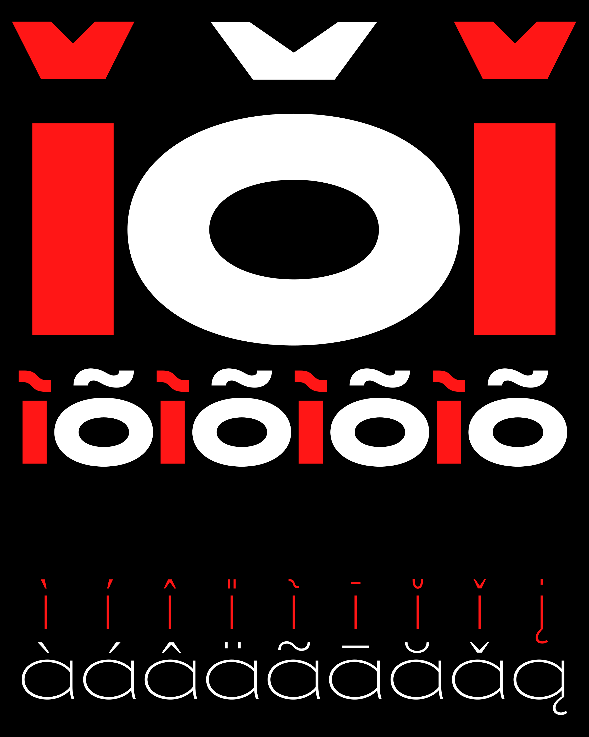
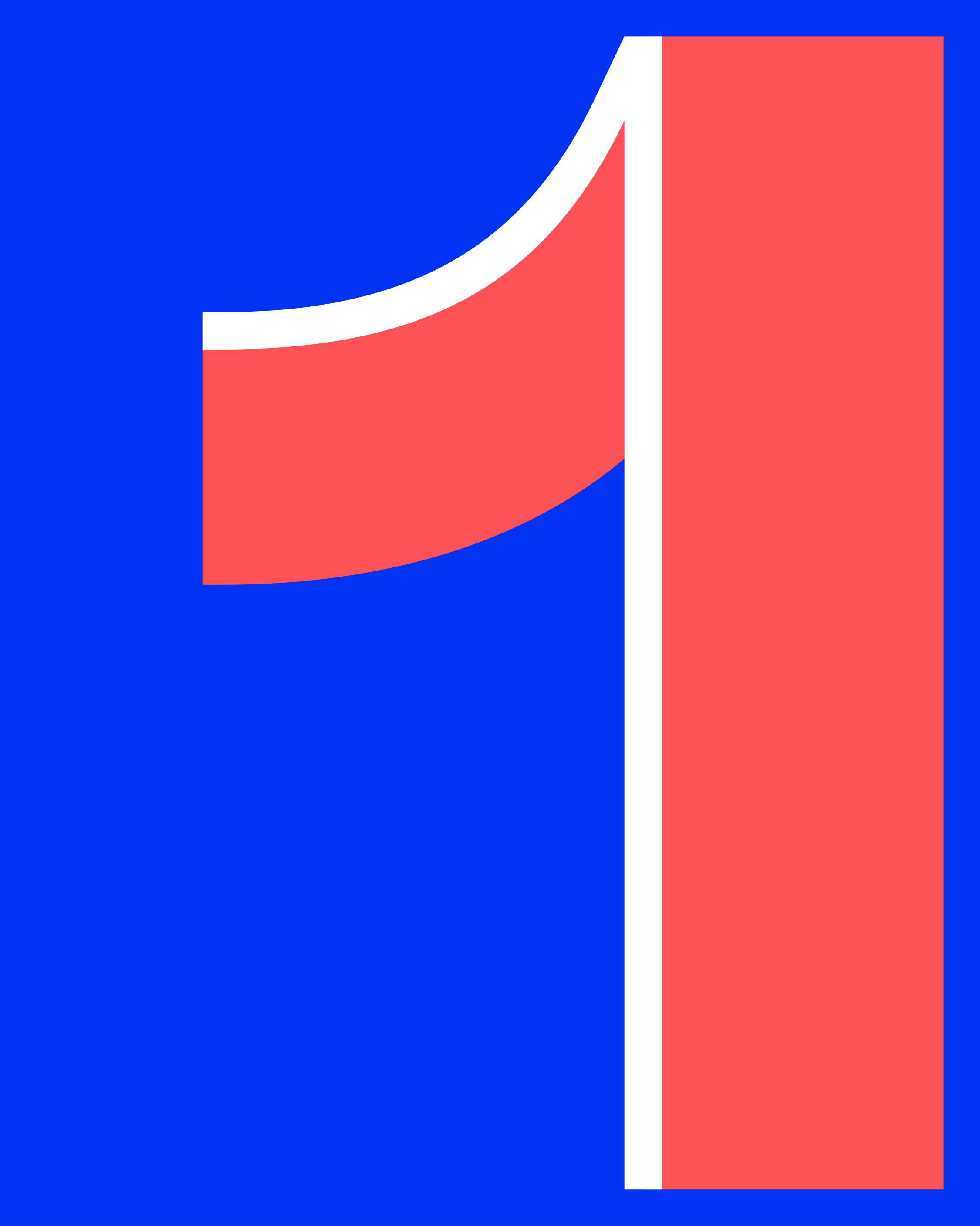
As any modern typeface should, Koralle Neue offers an expansive character set and kerning. There are also a few features that add practicality and even amplify features of the original. The numbers and mathematical symbols all have the same width, making them usable in tables. It was only the design of the 1 that needed to be changed to make that possible. However, the original 1 is available as an alternate glyph. The distinctive “ch” and “ck” ligatures of the original are also available through the “discretionary ligatures” OpenType feature.
The result is Koralle Neue: a type family with unmistakable character and deep roots in the history of typeface design, engineered to be truly usable and versatile in the digital age.