This is a corporate typeface designed for Hébbey, a high-end equipment retailer and coffee roaster, based in India and Switzerland. The goal of the project was to retain the brand recognition of the existing logo while creating something noticeably fresh and new, and carrying that over into a typeface family. The existing logo, based on the Rockwell typeface, provided the starting point. The logo only contained four letters, H, e, b, and y, which allowed considerable freedom for the rest of the design.
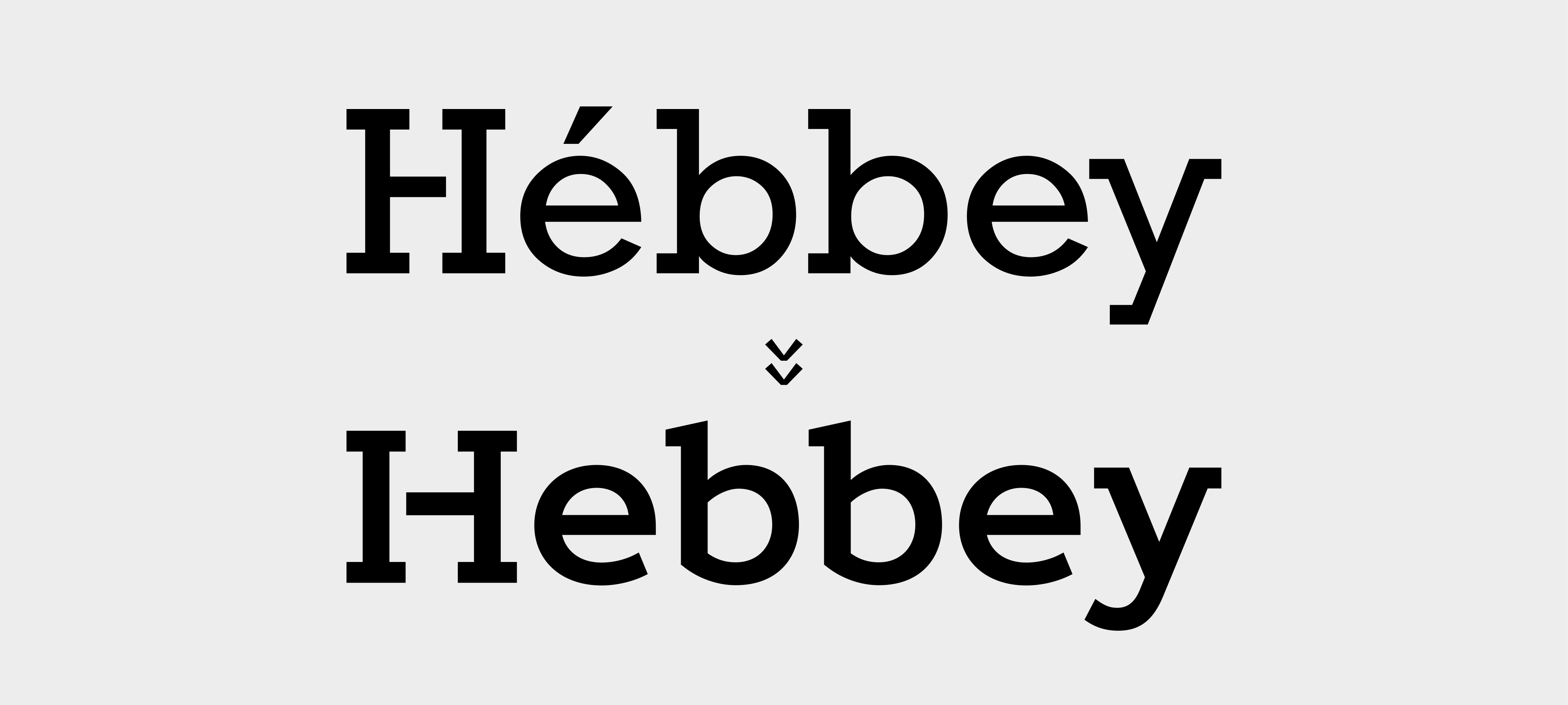
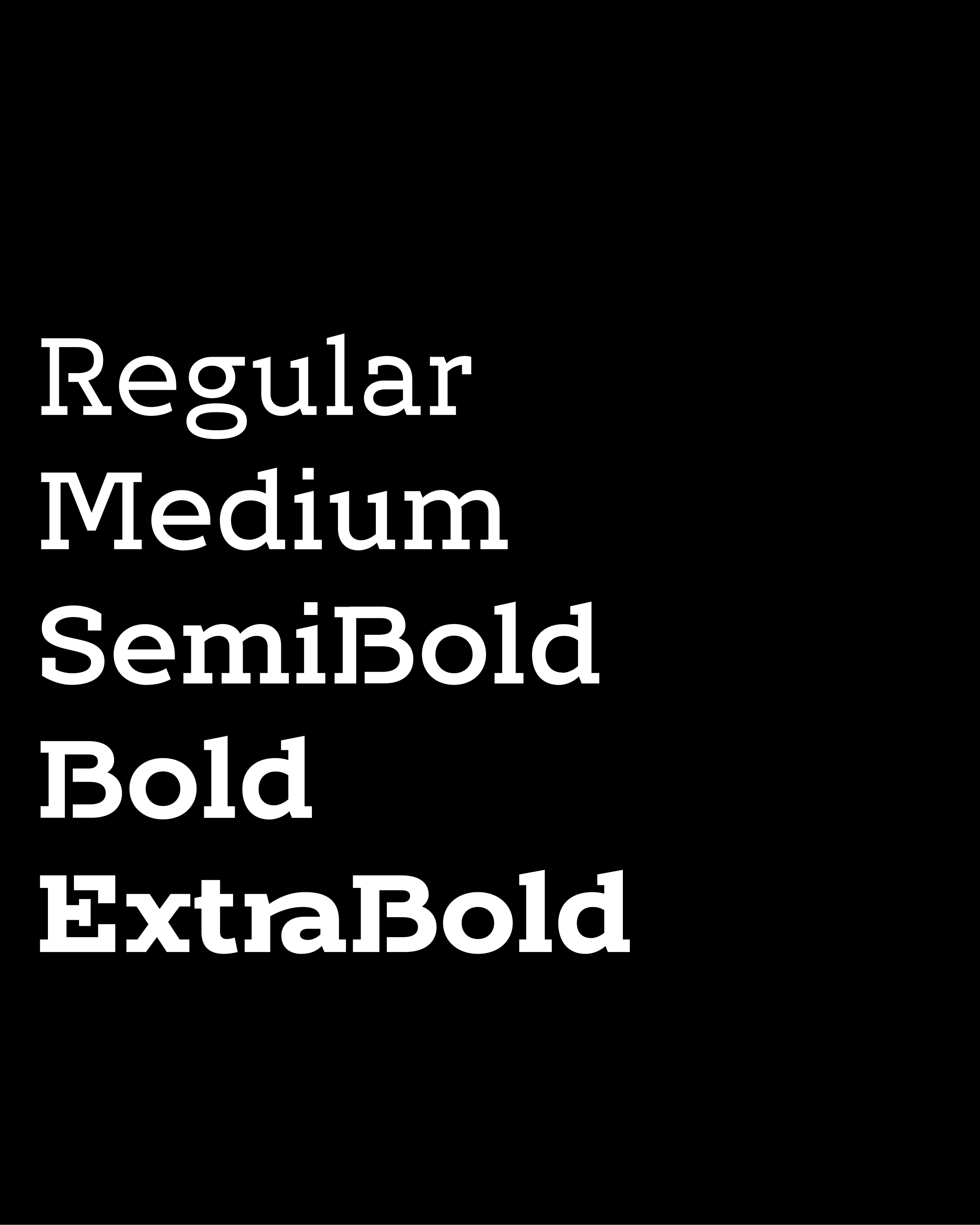
The result is a geometric humanist slab-serif with stencil elements... doesn't exactly roll off the tongue, I know! The letters were designed to have a specific and unmistakable character to make the Hébbey brand stand out. Naturally, that makes it difficult to categorise.
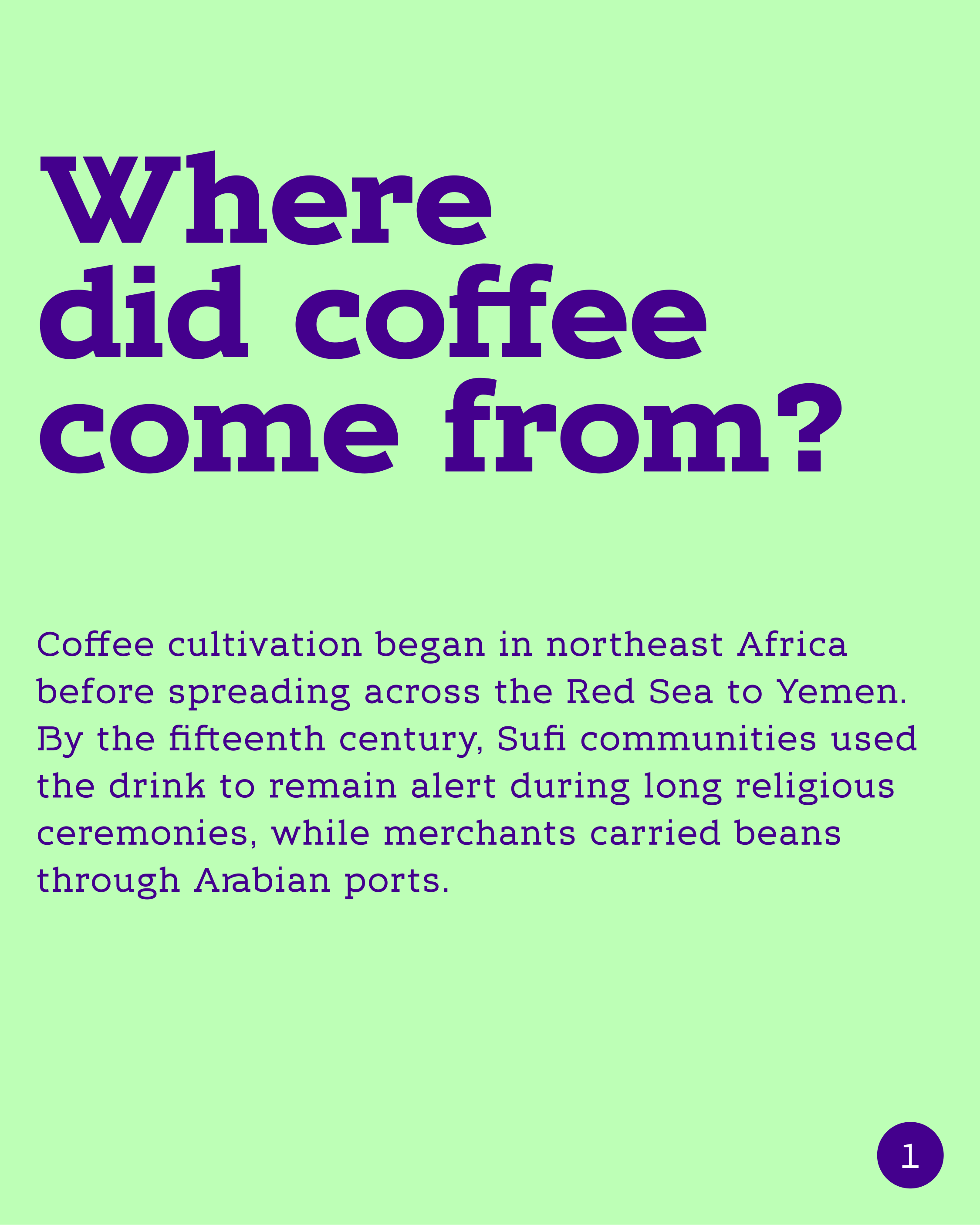
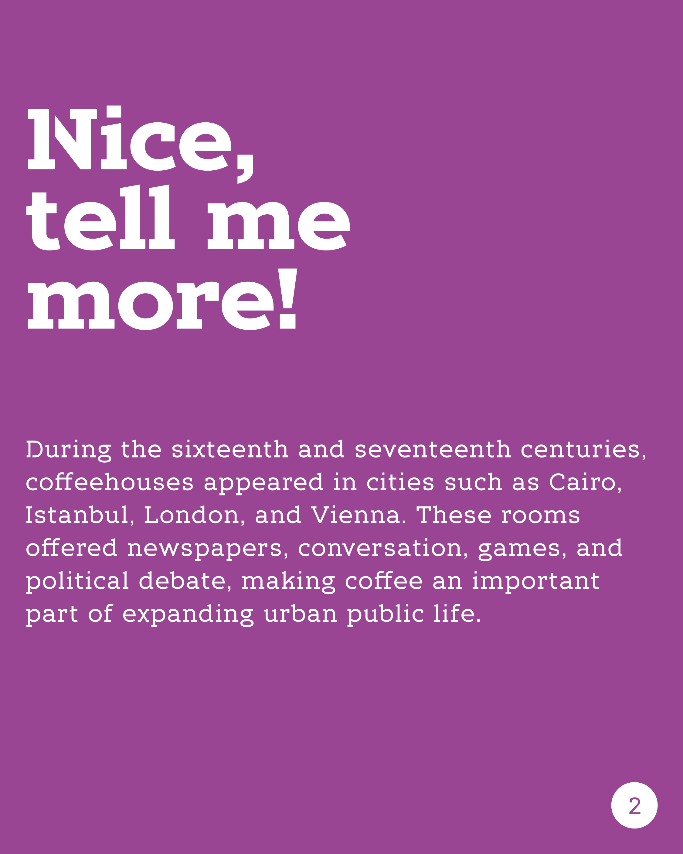
The letters are more playful in their design but more strict in their proportions. The typeface mixes stencil and unbroken forms, and the lowercase g is essentially two stacked loops. At the same time, the footprint of the letterforms, including the funnier ones, was designed with readability in mind. This has the effect that the quirks show themselves at larger sizes, but retreat at smaller sizes, making the letters highly readable.
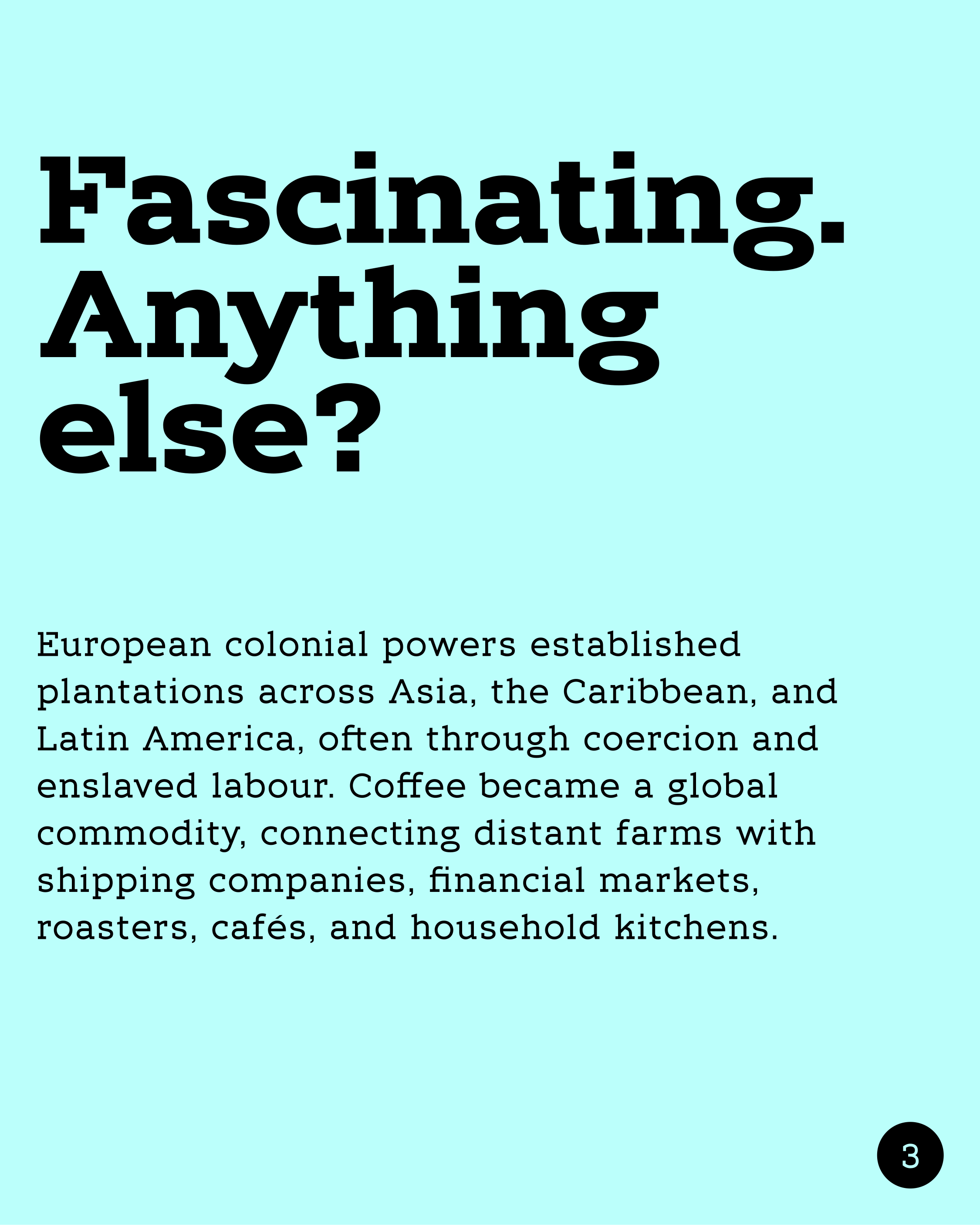
The numbers and mathematical symbols natively share a fixed width, so they align without requiring a separate set of tabular glyphs. The typeface also includes a large selection of ligatures and oldstyle figures. Language support is deliberately limited to what the project needs, keeping the scope of the typeface proportionate.